New Falcons logo two years in the making
 CREDIT: SARAH WATTS
VP Athletics and Residence Alan Bushell, Becca McCarron and VP Internal Affairs Cheriss Marson at the logo's unveiling January 18.
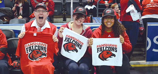
Fanshawe Athletics revealed a new Falcons logo on January 18 at the halftime of the Falcons men’s basketball game against Lambton College’s Lions at the Budweiser Gardens.
Fanshawe College students, alumni, professors and staff were asked in November to choose their favourite logo from five options. The most popular – which won by a wide margin, according to Nathan McFadden, Fanshawe’s manager of athletics – was selected to be the teams’ new logo.
The project started in late 2012 when McFadden came to the college. With the changes in the athletics department in the past years, the stronger teams and the stronger program, the department was looking for a logo that represented the team’s new spirit, McFadden said. People were not gravitating towards the previous logo, which had been in use since 2000.
“We really wanted to encompass our rebranding of the entire varsity program by having a new logo to reflect something that’s more modern,” he said. “We think that what we’ve come up with and created is a great reflection of that and something that will be much more likened by our students.”
Fanshawe graphic designer Andrew Campbell was put in charge of designing different versions of the logo, a project he said he enjoyed doing because of his love of sports.
One thing he says he particularly liked about the work was learning about the falcon, making sure that the logo wasn’t just a generic-looking bird or that it wouldn’t be mistaken for an eagle while still looking like a sports mascot.
Campbell says it was an honour to have had the opportunity to design a brand and put his stamp on an area of the college as large as the athletics department.
As for the decision to let students, alumni, professors and staff choose the new logo, Campbell says it was inspired by the college’s decision to do the same with the North Star logo.
“What we wanted to do is make sure that it wasn’t just a core group of five, six, seven people making this decision for such a large brand that touches so many different people,” he said. “We wanted to give them the opportunity to vote, because they’re the ones that have to want to represent it and who have represented it in the past.”
McFadden couldn’t be happier.
“We’re really excited about it,” he said. “Excitement, empower, strength and tenacity, those are things that we emphasize with our varsity athletics program, and we wanted that to be reflect in our logo, so we were really excited with the work that Andrew did. He did an outstanding job.”
