

Turn Boring Spaces Beautiful: Colours, colours and more colours!
 CREDIT: HOUSEANDHOME.COM
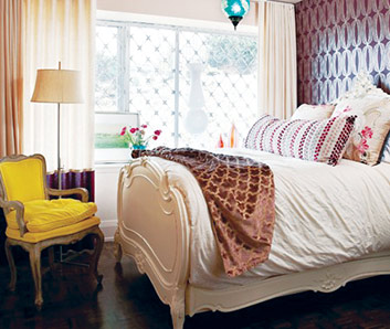
The chair�s pop of colour brings some life into this neutral-toned bedroom.
A successful design must have a functional layout, but a layout will not be 100 per cent successful if it is not visually pleasing. How colour is incorporated into a space is the second most important element in design. With improper use of colour, a functional room can easily turn into a colourful nightmare or a dull and boring space! Having a balance between neutral colours and accent colours will leave you with a visually pleasing space.
The majority of you may be asking, "How do I know what is too much or too little?" or "Do these colours really match?" You may even be wondering what the trending colour is for 2013 and how you can incorporate trending colours to your space. I have some simple tips for you to ensure you get the colour component of your design right.
Having too much or too little colour in a space will take away from the design. You want just enough colours to add excitement to your space. Having a balance between neutral colours and accent colours is essential. Neutral colours are typically colours that will go with a variety of accent colours, such as white, black, taupe, beige, browns and greys. Accent colours are generally the fun and exciting colours like purple, yellow, green, red, orange, blue and pink.
Incorporating colour through accent walls and pieces is one simple solution to ensure you get the right amount of colour. Having one bold and colourful wall in your space will create an accent wall. Use this wall colour to inspire the other colours for accent pieces such as pillows, throw blankets, pottery, artwork and area rugs. Be sure to incorporate neutral furniture pieces to balance out the space. If you feel you have too much or little colour you're probably right, just add more neutural components or colourful pieces to your space.
Matching colours is not always an easy task for everyone. One simple way to ensure your colours will match is to use complementary colours. The complementary colours are in pairs: red and green; blue and orange; and yellow and purple. It is easy to get creative with these complementary colours using your favourite shades and patterns. Having bright and bold or pastel accents colours and patterns is entirely up to your preference. After all, no one said you had to use generic colours for accent pieces! When you use complementary colours, there is no doubt that your space will be visually pleasing.
Emerald green is the hottest colour of the year for 2013. If you find yourself wanting to keep up with interior decor trends, it is easy! Having neutral furniture pieces and wall colours is the solution to the problem of keeping up with popular accent colours every year. A few items that you can easily change to update to current colour trends are pillows, curtains, area rugs, pictures and pottery. If keeping up with colour trends is a must for you, remember it is simple to do!
How you incorporate colour can either make a room a colour nightmare or be dull and boring. Having a balance between natural and accent colours is the solution to having a visually pleasing space. When you follow these simple steps, you're sure to have a well-balanced, colourful space.